When you build a website product in 2026, the gravity is enormous: give people a dashboard, a page builder, blocks to drag, and add an AI assistant in the corner. Everyone knows how to build that. We decided the editor itself was the failure mode, and refused to build one.
What an editor actually costs
An editor is a second piece of software the owner has to learn and operate, sitting between them and their site. It is where afternoons disappear. It is why a tradie's hours are still wrong in the footer eight months after they changed them on the contact page: the editor made the owner the operator, and the operator has a business to run. Every editor also drifts: what you see in the builder and what actually renders on a phone at 8pm are related, not identical.
What replaced it
A conversation with rails. You tell the Manager what you want, in the channel you already use (email works, the dashboard chat works, replying "yes go ahead" in plain words works). Then the machinery takes over:
- The change is made on a temporary copy you can share, never the live site.
- The copy must pass the site's automated checks: layout at phone and desktop sizes, links, forms, contrast. A change that breaks the site cannot reach you, let alone your visitors.
- You get a preview link to the real page, not a mock-up, with a plain summary of what changed. Iterating on a preview is free.
- One tap approves. Publishing is versioned; the previous version is one approval away, forever.
There is nothing to learn because there is no interface to learn. Email already is one.
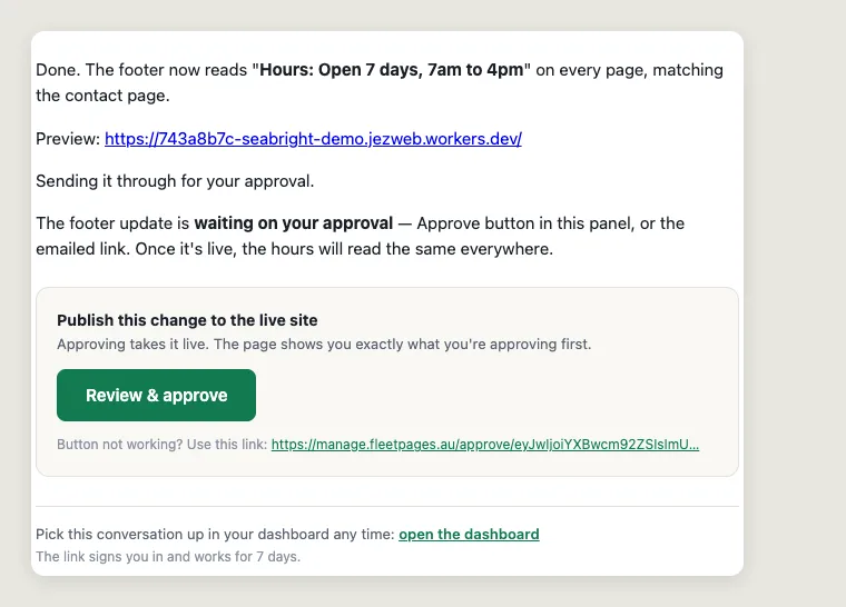
The rule we enforce in code, not in copy
Only ever one thing waiting for your yes. It sounds like a UX nicety; it is actually the load-bearing safety rule of the whole system. Early in testing we found the nasty version of the alternative: park an approval for change A, then change your mind and preview change B, and that old approval email for A is still sitting in your inbox like a landmine. Click it a day later and it would publish the stale version over the new one.
We did not fix that with a warning in the email. We fixed it with machinery: the moment a new change parks for approval, every older parked approval is withdrawn automatically, its draft is cleaned up, and its old link now says "nothing waiting" instead of doing damage. The Manager tells you it happened. Prompts and promises are how AI products usually handle safety; we think the rails have to be code, because the whole point is that you should be able to be careless with this thing and stay safe.
What the owner never sees
Under the conversation there is an ordinary, boring, excellent website: hand-built static pages, versioned in git, deployed on infrastructure that does not need patching on a Tuesday night. No plugins to update, no admin login to steal, no database to corrupt. The Manager operates the machinery; the owner only ever sees the two moments that matter, the preview and the yes.
The result is a strange and pleasing inversion: the less interface we shipped, the more capable the product got. Every hour we did not spend building block editors went into the agents' judgement, the checks, and the rails, the things that make "just ask" actually safe.
A month on, one of these arguments lost
The post above is left exactly as it was written on 10 July, because a dated opinion that quietly edits itself is worth nothing. But a month is a long time, and two things in it need answering.
There is now an editing surface, and it is on the page. Signed in on your own site you can point at any bit of it and retype the words, remove something, duplicate it, move it, swap a photo, ask for a whole new section, or describe what you want on the card, then send the lot with one button. So "no edit button" is no longer literally true, and pretending otherwise would be exactly the sin this post was about.
What the argument was actually about survived. There is still no CMS to log into, no second piece of software to learn, no admin account to lose, and nothing you do on the page changes the page. Every gesture is a request that comes back as a preview you approve, which was the load-bearing claim all along. What we got wrong was assuming the editor and the admin panel had to arrive together. They did not: the panel was the part that cost people their afternoons, and it is still not there.
And one correction. The list above says a change must pass checks for "layout at phone and desktop sizes, links, forms, contrast". That was ambitious rather than accurate, and it stayed on the page longer than it should have. What genuinely runs on every fresh preview is the width sweep: seven screen widths from a small phone to a wide desktop, screenshotted and checked for mechanical breakage, with anything it finds going to your Manager. It runs alongside the preview rather than in front of it, so it informs rather than blocks. Links, forms and contrast are checked when a site is built, not on each edit. The editing guide covers what the on-page surface actually does.